Phygital Us
About the project
Date:
Sep 9, 2022
Project
USYD DECO2220 Studio project (group project)

Overview of the problem space
E-waste, a toxic and non-biodegradable environmental risk is accumulating in the environment, in the soil, air, water and even living things. These materials contain high levels of contaminants such as lead, mercury, arsenic and many more. With the increase of electronic usage, a new form of pollution comes to exist; digital pollution. Most users are unaware of the escalation of this problem and continue to contribute to it unknowingly. We sought out to research problem areas, explore solutions and go through iterations to design a creative solution to E-waste.
Link to our full report: https://drive.google.com/file/d/1KZm2-85HYPdw8NvIFg_6ylvTfaK-Kb2o/view
🎨 The design process 🎨
🔎 1. Discovering the problem

To gain a broad understanding of the topic, we individually dove into researching different issues surrounding digital pollution in hopes to find a refined problem area.
🔬 2. Defining the research
Amongst all the individual user research held in our group there was a common lack of awareness about e-waste. Consumers weren’t aware of how detrimental e-waste was to the environment; they weren’t aware of how much digital waste they produced using their phones, weren’t aware of how much toxic materials composed their devices, etc. Additionally, there was a lack of satisfaction or knowledge on current e-waste recycling solutions.
We took this as an opportunity to design an interactive solution that can provided the public with an engaging and educational experience to recycling solutions.
Problem statement at hand:
“How might we provide an interactive solution to e-waste that simultaneously raises awareness on digital pollution across the general public? “
💡 3. Concept development
Building upon the key user needs that were identified from our individual research in the previous assessment task, a brainstorming session for idea generation was held as a team. This included determining the key interactive features of our design as well as the emotional and social aspects of the interactions. In consideration of these, refined ideas were generated and mapped out onto a collaborative Miro Board.
A snapshot of our miro board.

From here, we were able to finalise our concept and direction of design.
Our concept below:

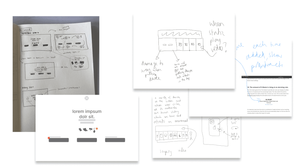
Initial sketches
A more in-depth discussion of the user interactions and concepts were held. However, during this process we noticed that each team member had a very different approach in terms of how all our concepts will be laid out and integrated into the final product.
To solve this, each team member decided to draw out sketches and wireframes of their preceived solution and present it to the group the following day. Having a visual representation of our ideas made it alot easier to communicate the ideas and visualise potential user interactions.
Then, a harris decision matrix was used to weigh out the pros and cons of each design against some criterias. This helped us to efficiently evaluate everyone's concept to choose one that we could move forward with. The criteria we created were:
How engaging and eye-catching is it to passers by?
Easy to use
Accessibility to different users/Learning curve
Ethics canvas
An Ethics canvas was also mapped to consider potential user implications. Some user pain points and potential dark patterns were identified from this:
Public Shaming:
As part of the interactive games on the main screen, we originally intended on asking users how much of their device they use and showing them the potential consequences of that. → This may cater to public shaming. Rather, we decided to provide facts for users rather than asking for their input.
Inappropriate use:
By integrating a physical gap for devices to be thrown into, there was the chance of passers by using it as a general waste bin. We decided to address this by automating the slots. These are closed when idle- and the correct bin will only open when the user walks up to the screen and specifies the type of electronic waste they are discarding.
Initial moodboard
Following this, we began browsing online for inspiration for our final design and collating them onto our moodboard. Using the moodboard, we were able to communicate what we would like our final design to look like. This includes colour themes and visualisations.Similar designs that are currently found in public spaces were also explored for inspiration and evaluation.

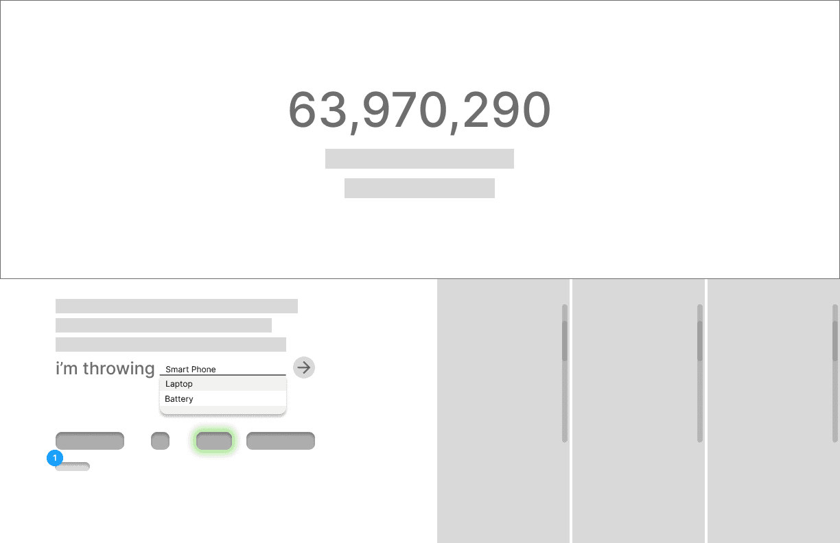
Low fidelity wireframes
Our design will consist of three features: a screen with interactive games that also functions as a bin, a microsite to enable users to track their waste and animated advert kiosks to advertise the feature in shopping centers. (more low fidelity wireframes available at end of page).
Initial Prototype


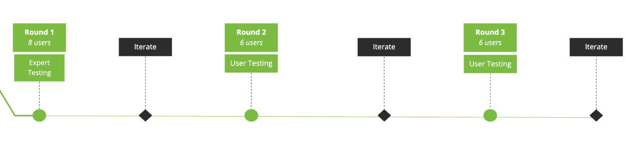
🧪 4. Usability testing
As part of our design process, rigorous usability testing were held in three stages with each round followed up by appropriate changes in the prototype. We conducted 3 rounds of testing and Iterated based off our findings.
Heuristic evaluation
Heuristic testing were done between 8 design students. Due to the physical nature and scale of our design, each part of the main screen was separated into different figma and Adobe XD prototype links that the experts can interact with via their devices (This same method was used for usability testing).
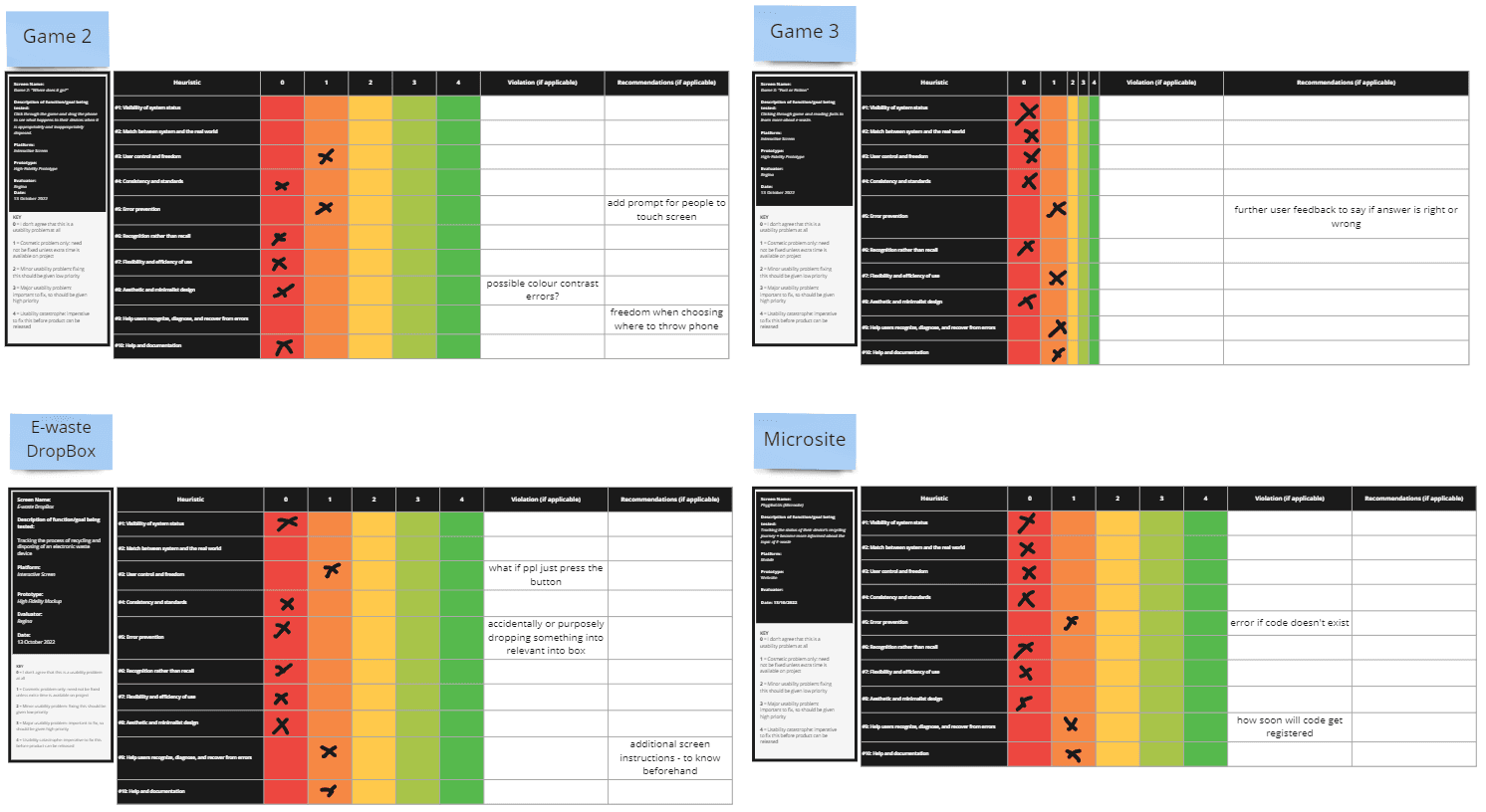
Each feature was compared and evaluated with Nielsen’s 10 usability Heuristic criteria.
This process was especially useful as it made us aware about things like adding error messages, ability to recover from errors and other things like design consistency.
Expert testing analysis
Results were analysed and synthesied from the above tables which were then Individually separated into positive/negative feedback from each prototype into an organised table.
User evaluation
Thorough usability testing with end users, testing was conducting in 2 stages, each with 6 participants (a total of 12) with necessary iterations according to feedback in between. Each session with the participants consisted of:
Pre test questionnaire
A pre test questionnaire was conducted to understand each participant’s awareness about E-waste as a topic of concern. This was used to determine how effective our design was in educating and seeding awareness by comparing it to the post test questionnaire.
Think Aloud Protocol
The Think aloud protocol was implemented to allow us to gain access to user’s thoughts and processes as they are interacting with our product. This enabled us to reveal gaps between designers and the user’s mental models and demonstrate how our design may be experienced with in a real scenario
User Testing Data Sheet/System Usability Scale
Usability refers to efficiency, effectiveness and satisfaction (Nielsen, 1994). Efficiency was measured by recording the time it took users to complete our set tasks, effectiveness through recording whether they were able to complete the task and satisfaction via the System Usability scale and simultaneously, the post test questionnaire.
Post Test Questionnaire
User Testing Analysis
System Usability Scale: Individually wrote out positive and negative feedback from each prototype into an organised table that enable us to compare usability.
Organising Feedback: A process similar to an affinity diagram was used to synthesis improvements that needed to be made. This process was repeated two times for each user testing round.
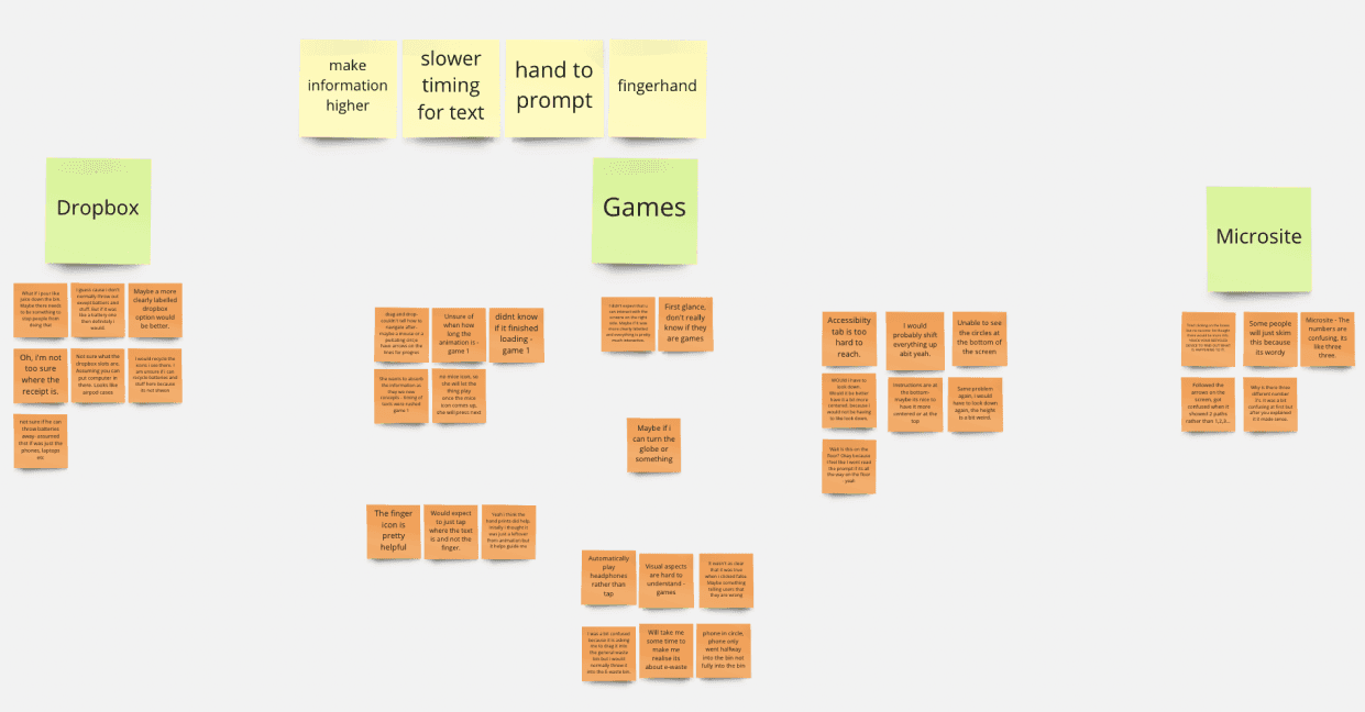
An organised chart for improvements that need to be made
Iterating & iterating
Because of our design having more than one interactive elemement, many small iterations were made in response to the feedback that we received. Iterations were consistently made throughout our testing phases.
As part of our design process, rigorous usability testing were held in three stages with each round followed up by appropriate changes in the prototype.
🎬 5. The final concept
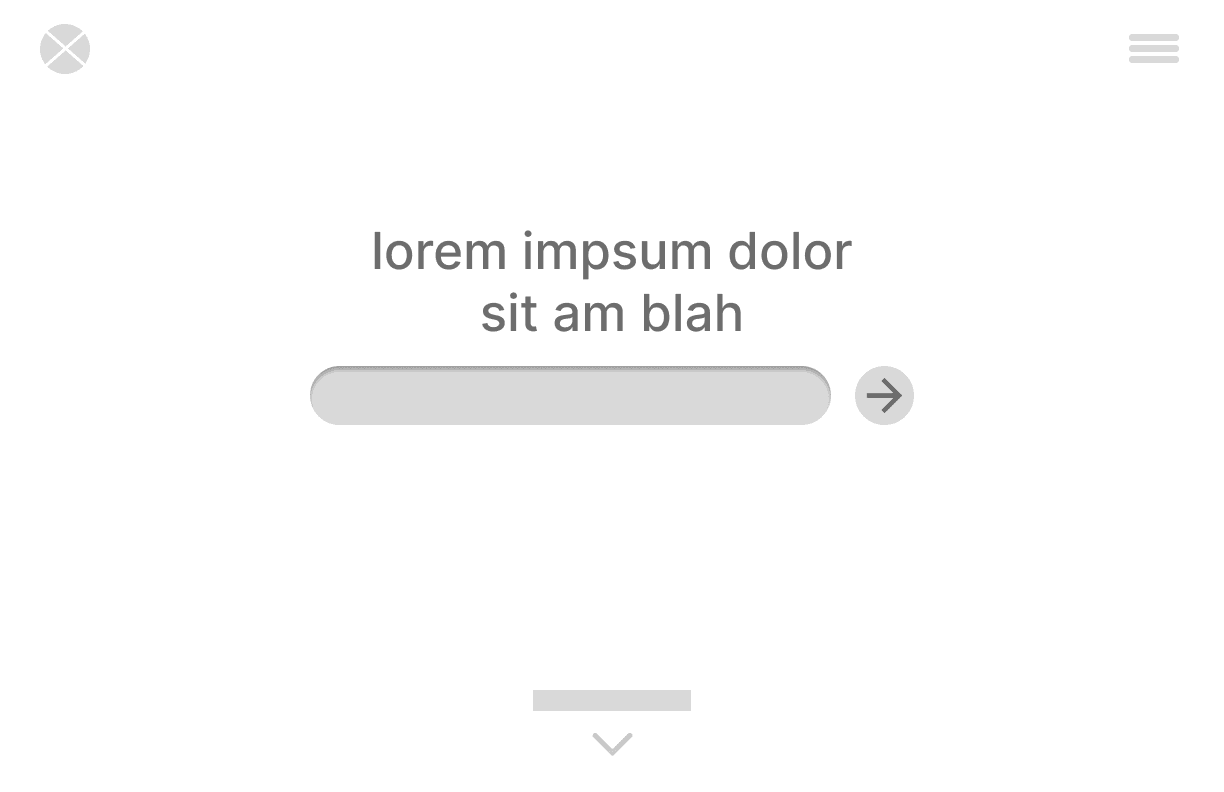
Phygital-Us is an educational solution to the problem of E-waste - an interactive, floor to ceiling public screen.
The main screen consists of a series of animations, interactive games as well as a physical E-waste drop box. With a dedicated microsite as an extension of the drop box, users are able to track their device throughout its recycling process.
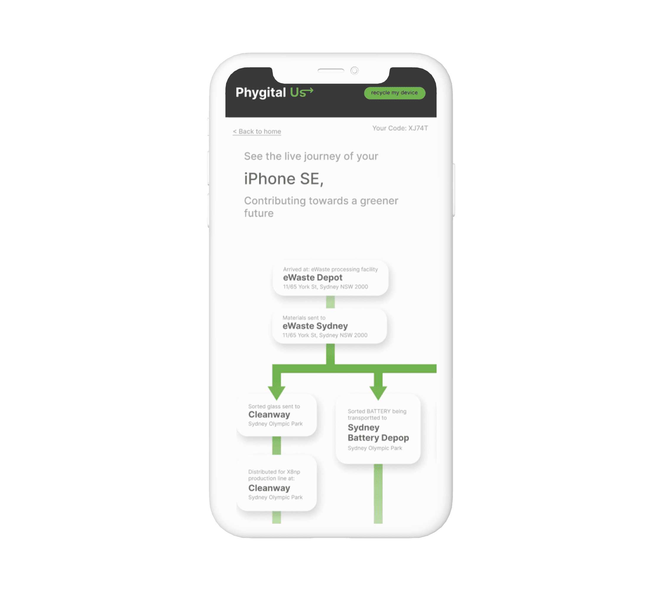
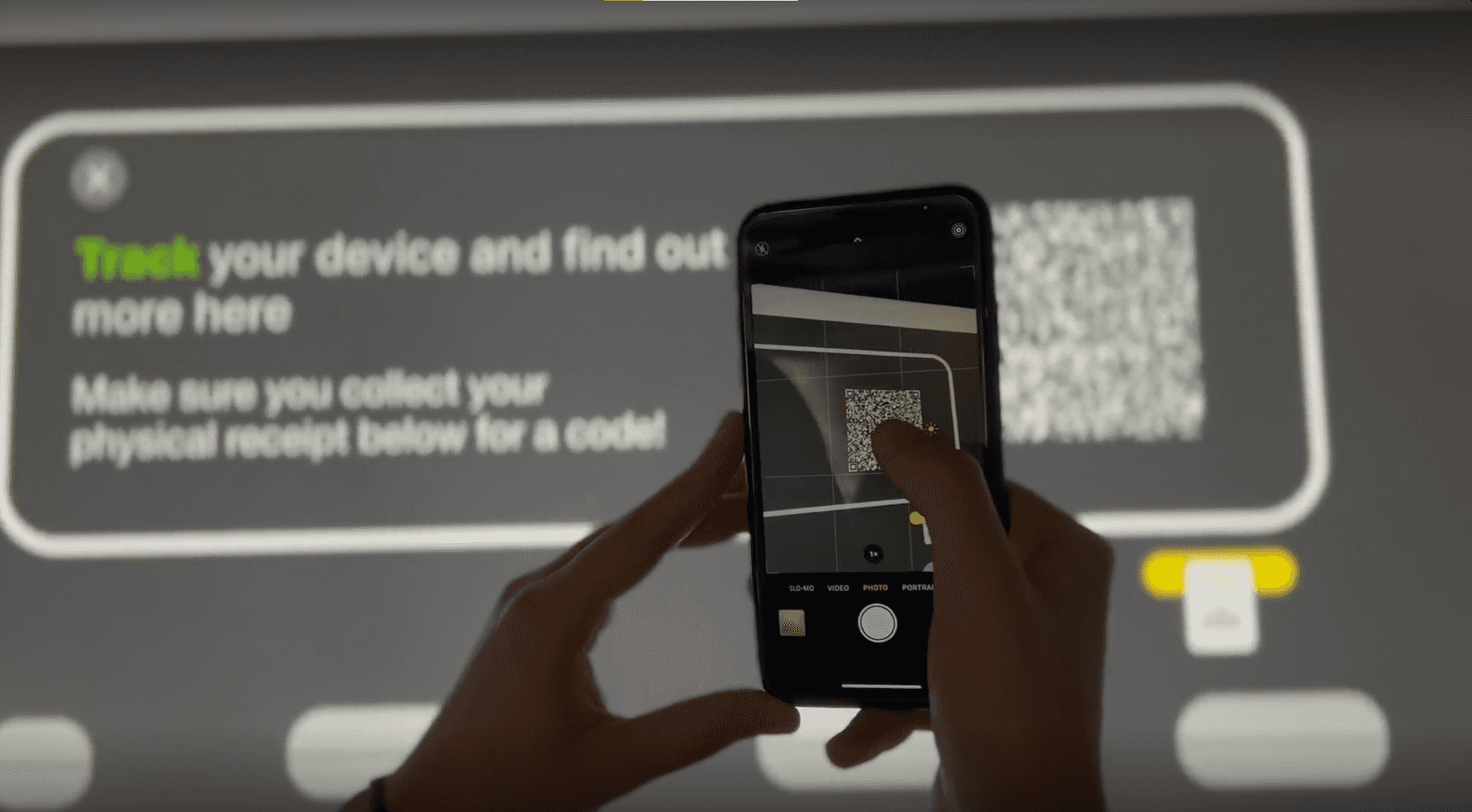
Main Screen : E-waste dropbox
The E-waste dropbox enables users to physically drop their electronic waste into the integrated bins on the screen. Users are then given the opportunity to track their item throughout the recycling stages via the microsite.
Prototype link: https://xd.adobe.com/view/9c0413ac-fc4d-4f3d-a569-09d51b351e62-c957/

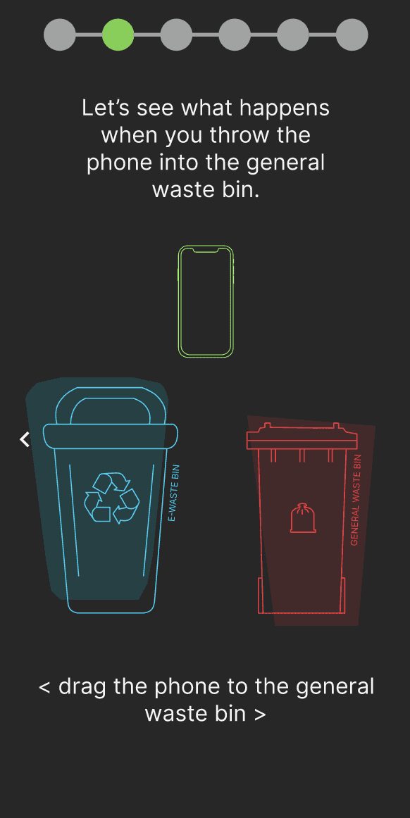
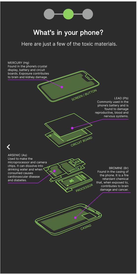
Educational walk through games:
Game 1 prototype: https://xd.adobe.com/view/736a60f6-8b3c-46d9-8a2e-c15ee8b7144a-2639/screen/e636f905-f446-468f-9f56-6f6c4c05caf9
Game 2 prototype: https://xd.adobe.com/view/5c448810-4896-47ad-9e47-b8c94c993823-0917/
Game 3 prototype: https://xd.adobe.com/view/408c11d5-d34a-474a-a645-d51b68b608e4-15df/
Below are snippet screenshots from each game.

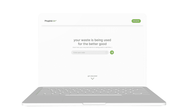
Microsite
The microsite enables users to track the items they have recycled by inputting the unique code generated on the main screen. It also informs users about further information about E-waste
Website prototype: https://www.figma.com/proto/6BzNDhKn6o7OZHLBfTPJlF/DECO2200-Wireframes?page-id=0%3A1&node-id=111-179&viewport=203%2C267%2C0.14&scaling=scale-down&starting-point-node-id=1%3A6&show-proto-sidebar=1

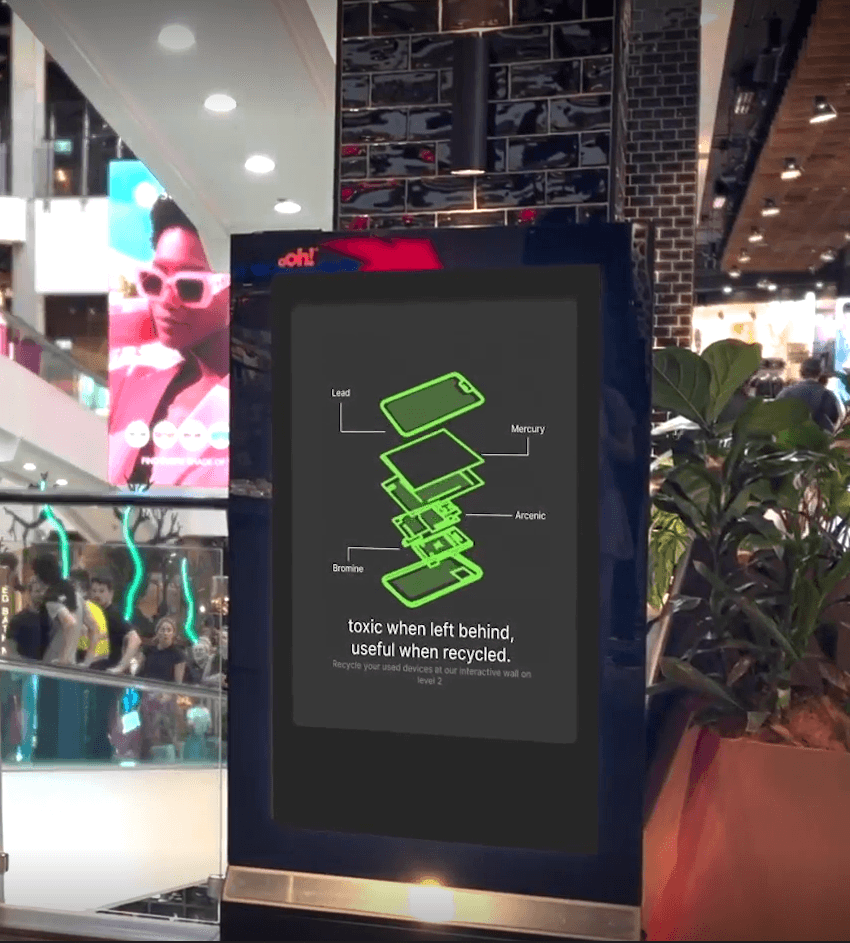
Advertising kiosks
These ad kiosks will be placed throughout the shopping center to guide users to the main screen.
Promo/Concept Video: https://www.youtube.com/watch?v=5svb7RP21rw
📚 6. Recollection
There were some limitations in our design process that impacted our final results and could be improved upon for further projects:
Technological Constraints: We faced technology constraints when testing our prototype with users. As we were unable to test the full scale of the interactive display with users, this led users to be confused with the scale and size of the screen.
Limited User Control: There were software limitations when designing and testing the multiple games in our interactive display. Users have a limited user control and freedom when testing the interactive games due to software accessibility.
Multiple Perspectives: We were also not able to test and receive feedback of our display from the perspectives of an elderly adult and even those with language barriers. Whilst we tested with one child, this doesn’t represent the experience of all children. This is limited as we were unaware if we need to design additional accessibility needs for various age groups.